🤫
This work is password protected.
Incorrect password.
FIS · 2025–Present · Case Study
Flex Web Admin is the configuration backbone for 4,900+ financial institutions. The tool was broken in ways that were costing FIS real business. We ran a research-backed discovery sprint, held the line when stakeholders pushed for a surface-level fix, and delivered a phased reimagine anchored to a Northstar that earned full executive buy-in.
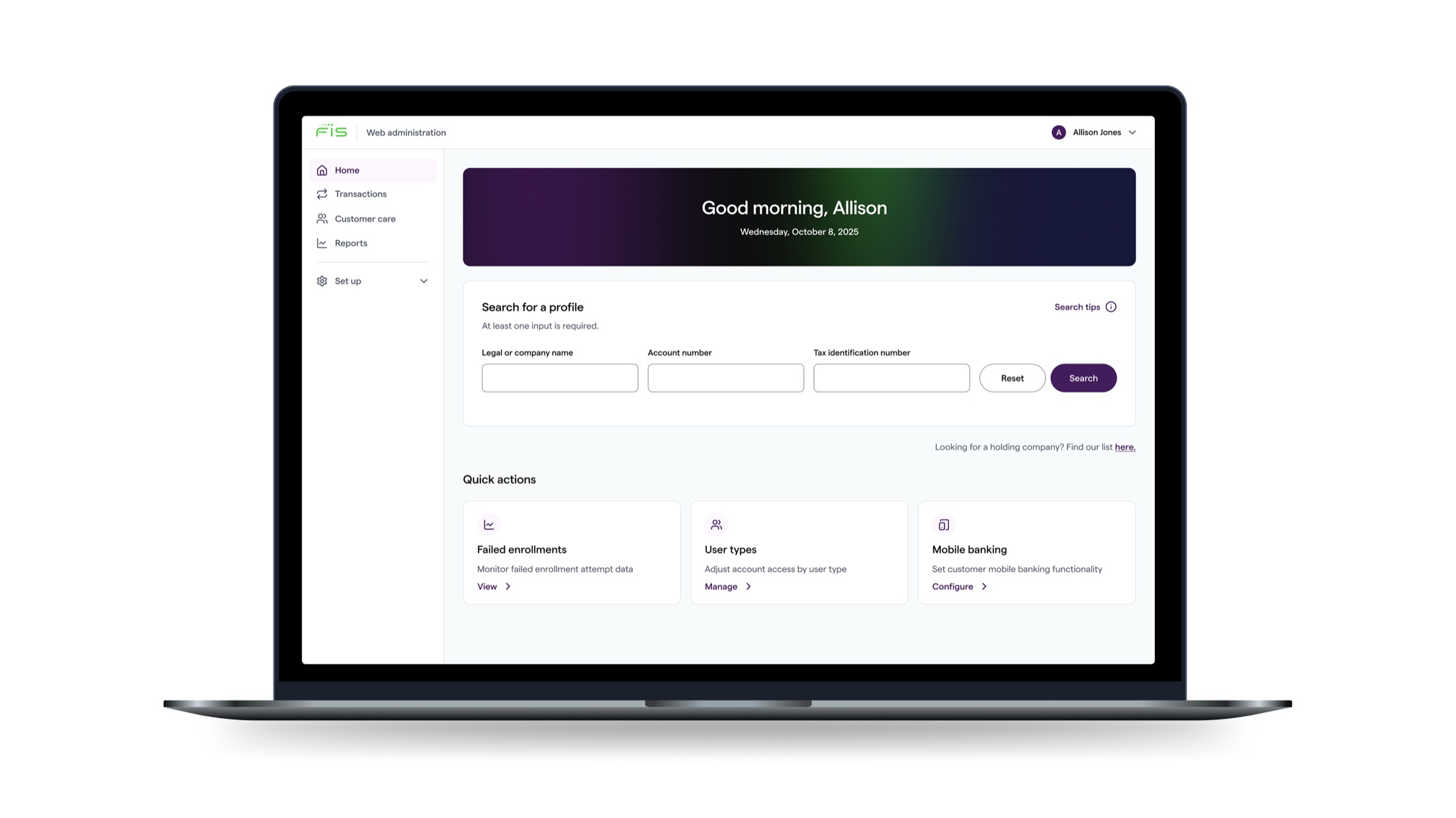
Fig 1 — Redesigned Flex Web Admin homepage and search experience
Context
FIS is a global fintech leader that processes over $10.3 trillion annually across 34 billion+ transactions for 4,900+ financial institutions. Within FIS, my team operates in the Digital Banking portfolio, designing the admin, banker, and teller experiences that power day-to-day operations at local and regional banks across the country.
Flex Web Admin (FWA) is the configuration program at the center of that work. Bank administrators use it to manage customer accounts, assign permissions, configure transaction fees, and customize the banking experience for their clients. Flex web admin is foundational banking software and in early 2025, it had become a business liability.
$10.3T
Processed annually by FIS
34B+
Annual transactions
4,900+
Financial institutions
The Problem
There was a user problem and a business problem. Treating them as one was part of why the tool had stagnated over the years.
A fragmented information architecture and the absence of a unified navigational framework forced bank administrators into constant context-switching. Basic tasks required a series of disruptive jumps across the platform. The tool was designed around the system, not the person using it.
FIS's legacy admin tools were fundamentally misaligned with what bank administrators needed. That friction was driving high sales attrition, blocking new business acquisition, and showing up as measurable revenue loss at the partner level.
"Our legacy admin tools are fundamentally misaligned with the needs of bank administrators. This friction drives high sales attrition and prevents us from capturing new business."
— VP, Business Executive
The objective was straightforward to state and hard to execute: modernize FIS admin tooling to drive both user efficiency and business growth.
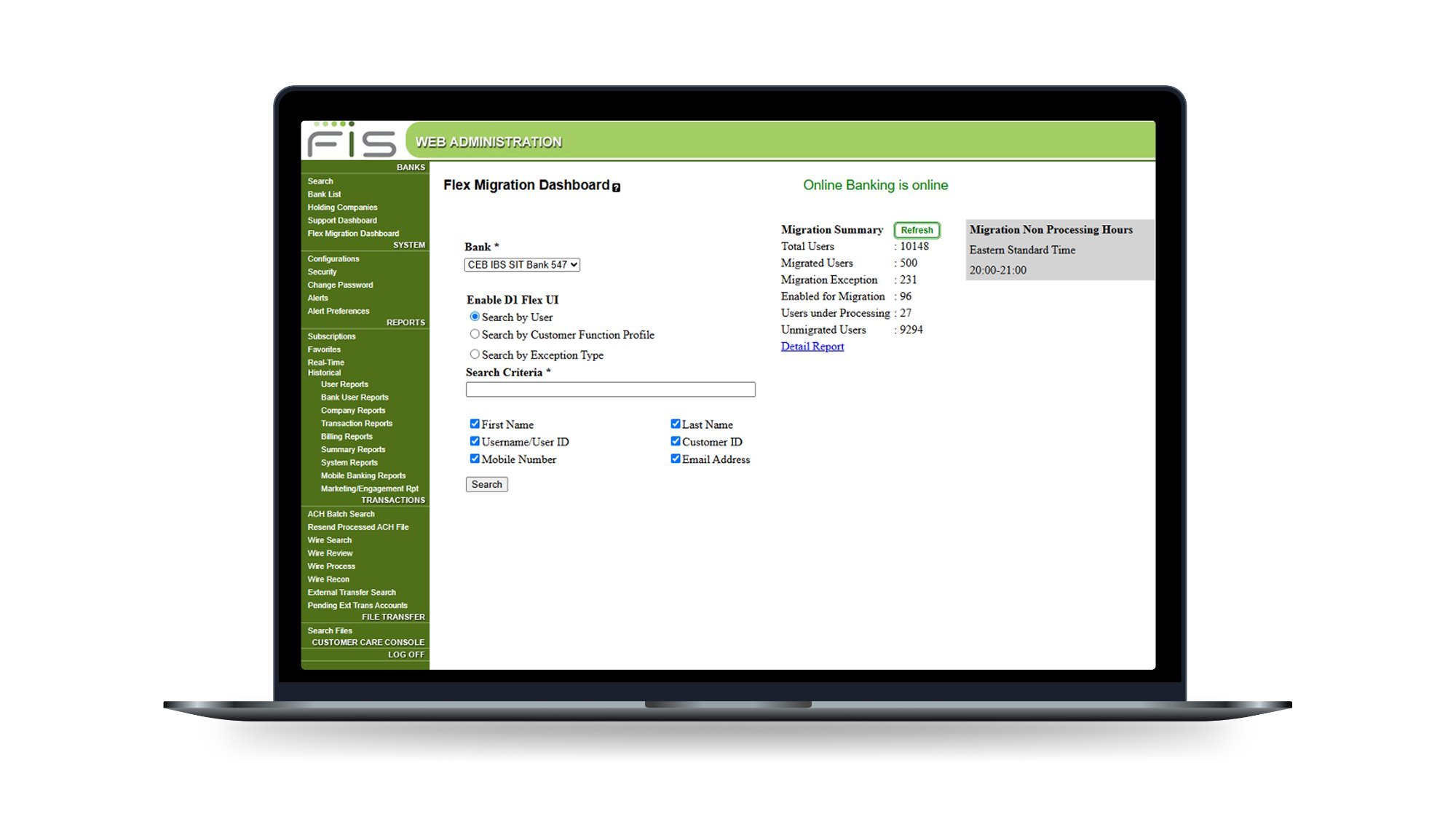
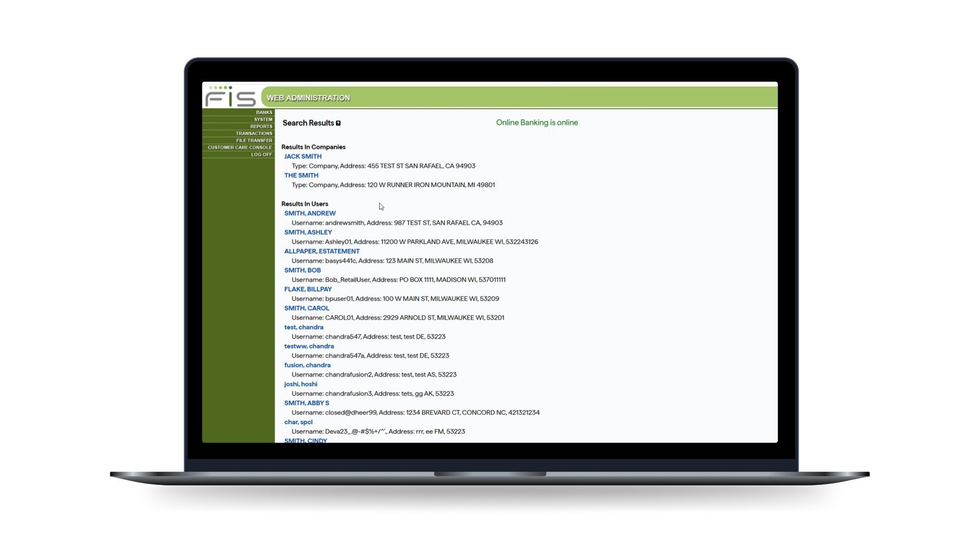
Fig 2 — Flex Web Admin homepage and search experience · Before state
Discovery
Before any design direction was set, we ran an accelerated discovery sprint to build a research-backed foundation. The team synthesized primary, secondary, and legacy research across a compressed timeline, mapping user requests and product debt against a competitive audit to define a clear prioritization for the reimagine.
21
End users interviewed
8
Bank representatives
20
Partner banks represented
Methods included qualitative interviews, competitive audits, heuristic and feature-level analysis, external workshop focus groups, user journey mapping, and an IA discovery workshop. We also synthesized prior UXR finding reports to avoid duplicating work that had already been done.
Four findings shaped everything that followed:
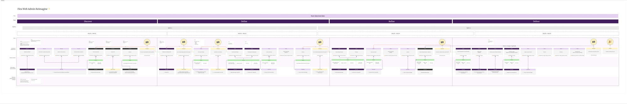
Fig 3 — Discovery methodology and synthesis approach · Generative research sprint
These findings mapped directly to four design priorities that became the guiding principles for all work that followed: streamline the navigation, prioritize customer tasks, streamline common actions, and automate workflows wherever the system allowed it.
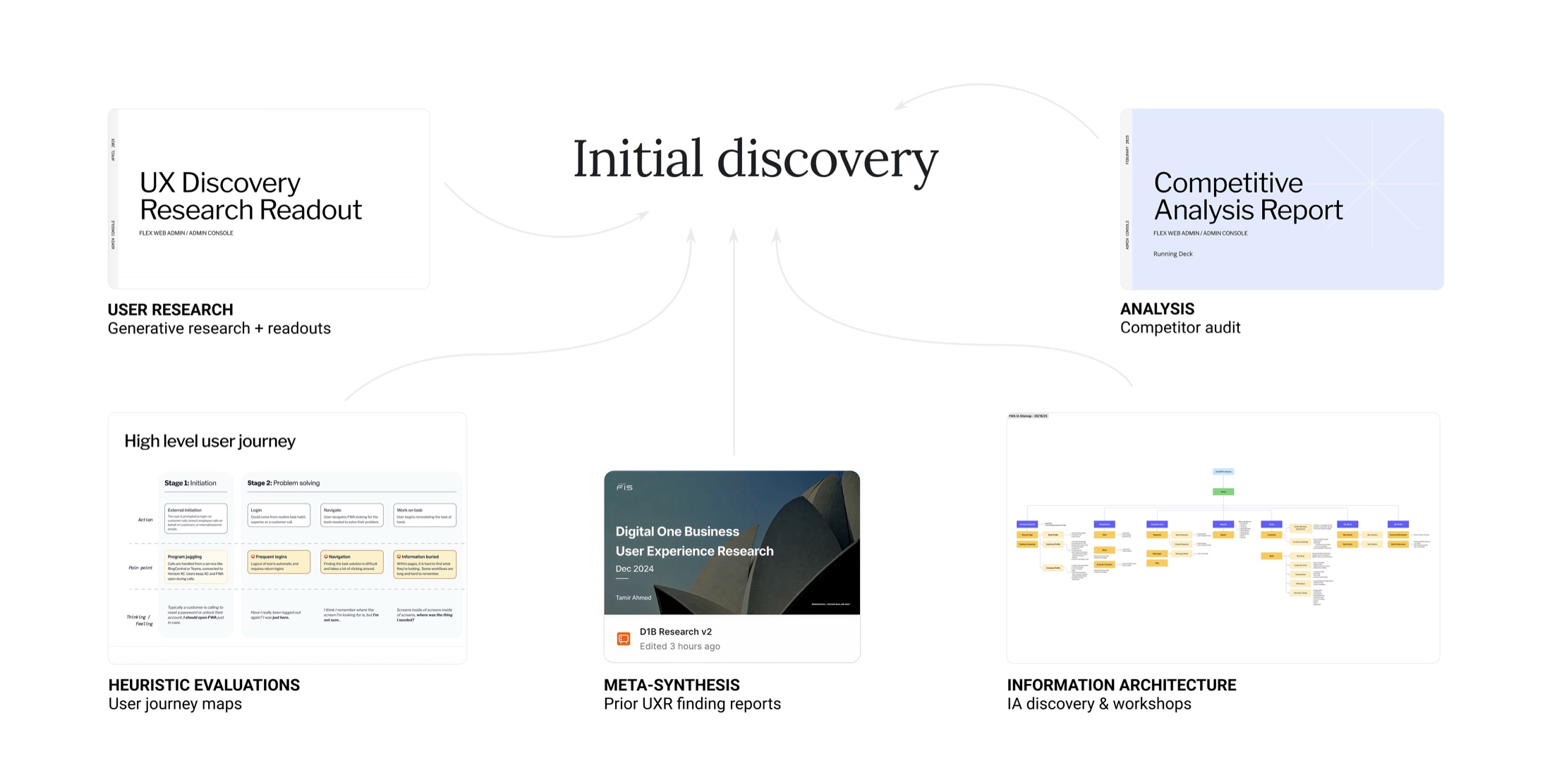
Fig 4 — All the inputs that went into product discovery
The Tension
After discovery readouts, stakeholders pushed to pivot. The ask: focus solely on a UI refresh, update the visual styles, polish the primary pages, and ship. It was faster, lower-risk, and easier to sell internally.
While we wanted to support the effort of shipping improvements quickly, we knew that a visual refresh wouldn't fix the core experience issues. It wouldn't resolve the context-switching. It wouldn't address the navigational disorientation we'd just spent weeks documenting. Users would have a nicer-looking version of a fractured experience.
The business case for deeper investment was already in the data, sales attrition and lost partnerships were tied directly to the UX failures we'd surfaced. We needed to make that case clear and propose a path that gave stakeholders something concrete to commit to.
"Stakeholders wanted us to pivot to focus solely on UI improvements. We had to do more for users."
The solution was a phased approach. Starting with a Northstar vision gave stakeholders a picture of where we were going before asking them to fund the full investment. Phase 1 became a concrete, deliverable-backed commitment they could approve immediately with the longer-term roadmap visible and sequenced behind it.
The Work — Northstar
With stakeholder alignment secured on the phased approach, we launched a vision sprint anchored by a collaborative workshop. The goal was shared alignment before any design direction was locked, not a presentation to react to, but a working session to build from.
The workshop surfaced vision themes, mapped existing pain points, and used "How Might We" framing to open the design space. From there, the team moved into concept development and storyboarding to sketch what a unified admin experience could look like end-to-end.
The output was Project Athena — a Northstar vision for Flex Web Admin that consolidated fragmented admin dashboards and introduced AI-driven support tools into a single, cohesive experience. Following a series of internal roadshows, the team secured full executive buy-in to begin building the next-generation web platform.
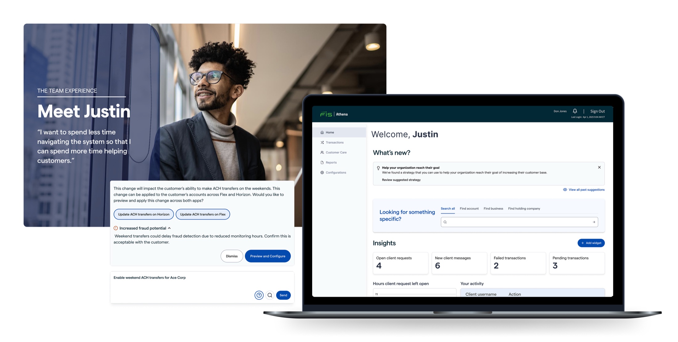
Fig 5 — Project Athena Northstar vision · Strategic vision phase
The Work — Phase 1
With the Northstar established and stakeholders aligned, Phase 1 focused on the IA, navigation, and design system work that would deliver real user impact while creating the infrastructure for everything ahead.
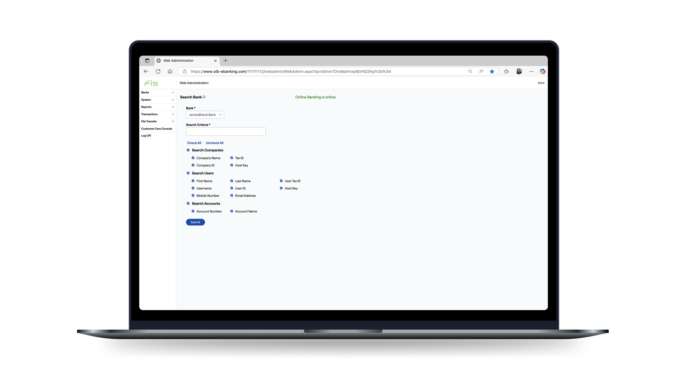
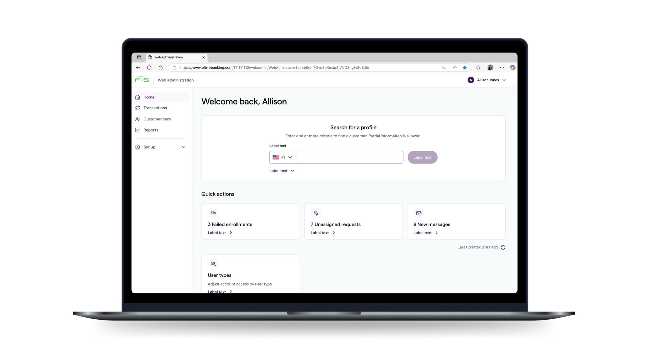
Fig 6 — Navigation before and after · Prior collapsible side-nav vs. target-state redesign
Beyond the IA and navigation, Phase 1 included a series of page-level redesigns focused on the highest-frequency workflows identified in discovery.
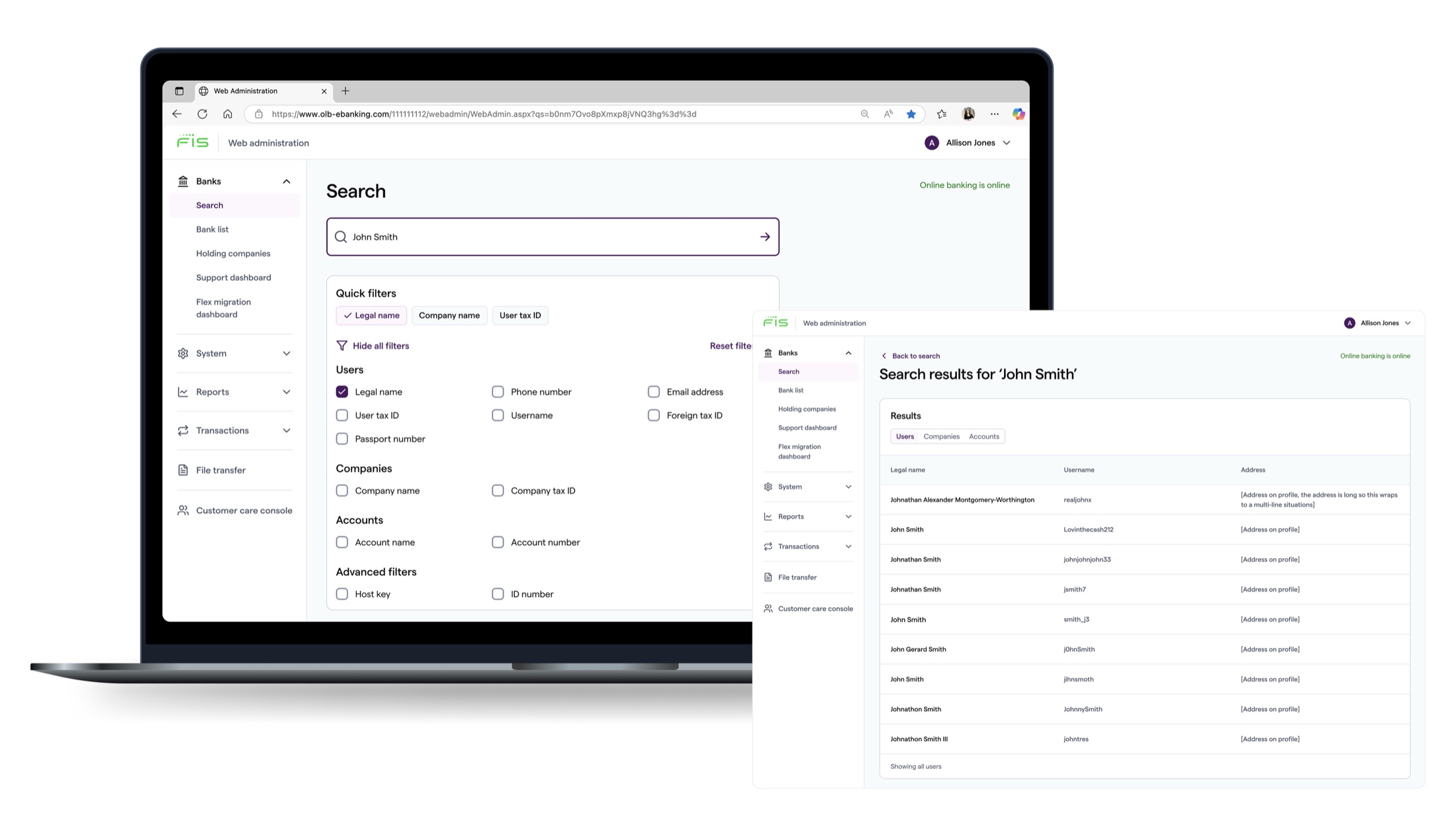
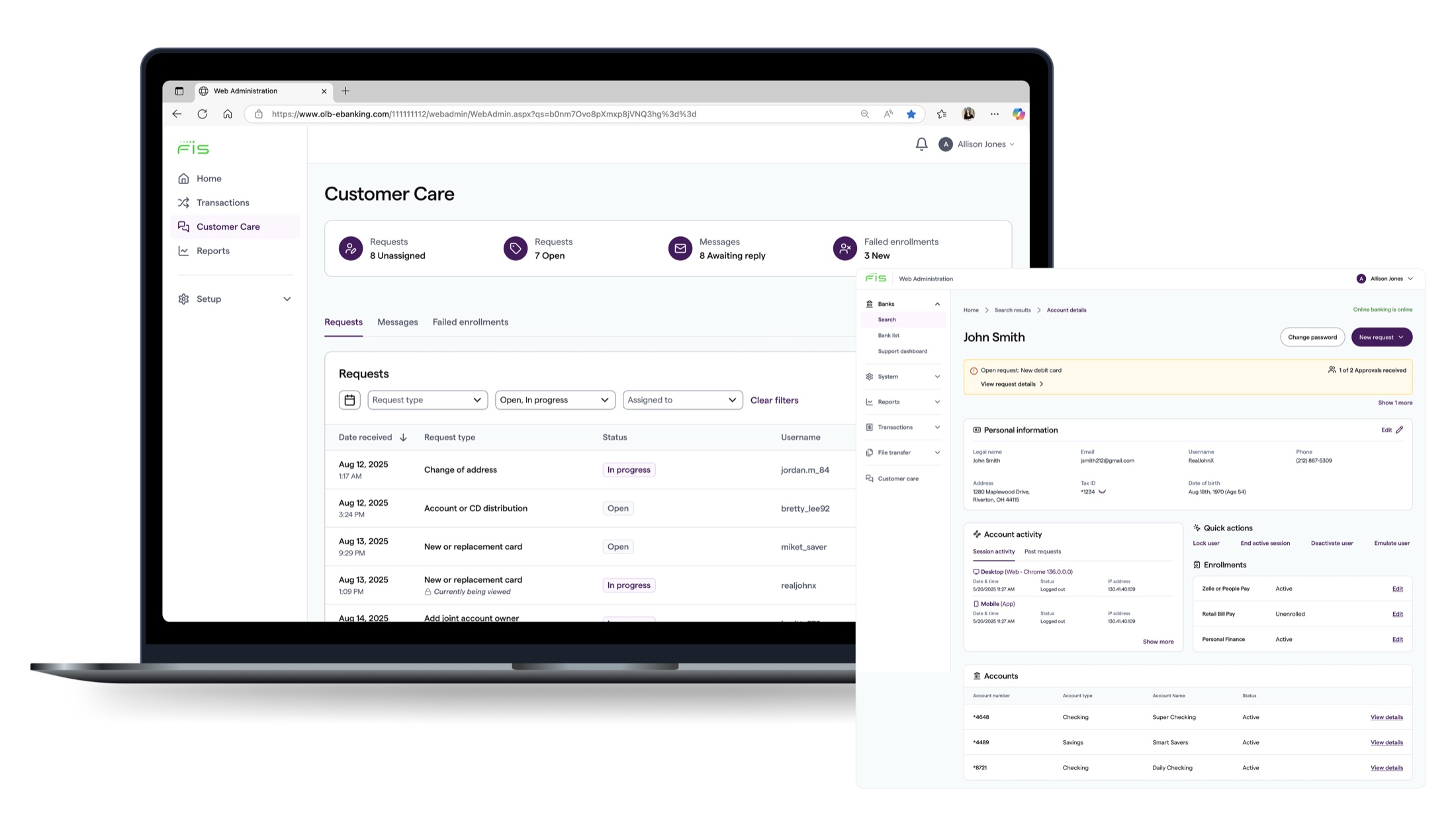
Fig 7 — Phase 1 delivered surfaces: navigation system, profile pages, and customer care center with task drawer
Results
The initial release demonstrated that a unified admin ecosystem reduces user friction, fosters cross-team partnership, and delivers measurable impact to the bottom line.
88%
Reduction in sales attrition after the phase 1 release
42%
Improvement in how users rated their satisfaction
2
New partnerships forged with cross-functional teams
Reflections
We relied on front-loaded discovery rather than embedded, continuous research. In complex admin domains, recurring access to real users throughout design and validation, not just at the start, would have caught assumptions earlier and reduced iteration cycles.
The design system ended up doing more work than we anticipated. Not just in standardizing the UI, but serving as a cross-functional alignment artifact. If I were starting over, I'd name that role explicitly from day one and bring engineering into the design system conversation earlier on the particular project.
Banking workflows are dense and deeply entrenched. Bridging the gap between "how it's always been" and a modernized vision required significant domain ramp-up. Earlier, more structured knowledge transfer from banking SMEs would have sharpened our framing faster.