🤫
This work is password protected.
Incorrect password.
Etsy · 2021–2023 · Case Study
Sellers are the heartbeat of Etsy, fueling human connections that serve 90 million buyers. The legacy "Sell on Etsy" app, built in 2017, had become a liability. We replaced it with a reimagined mobile experience purpose-built for running a business on the go, and learned some hard lessons about trust and adoption along the way.
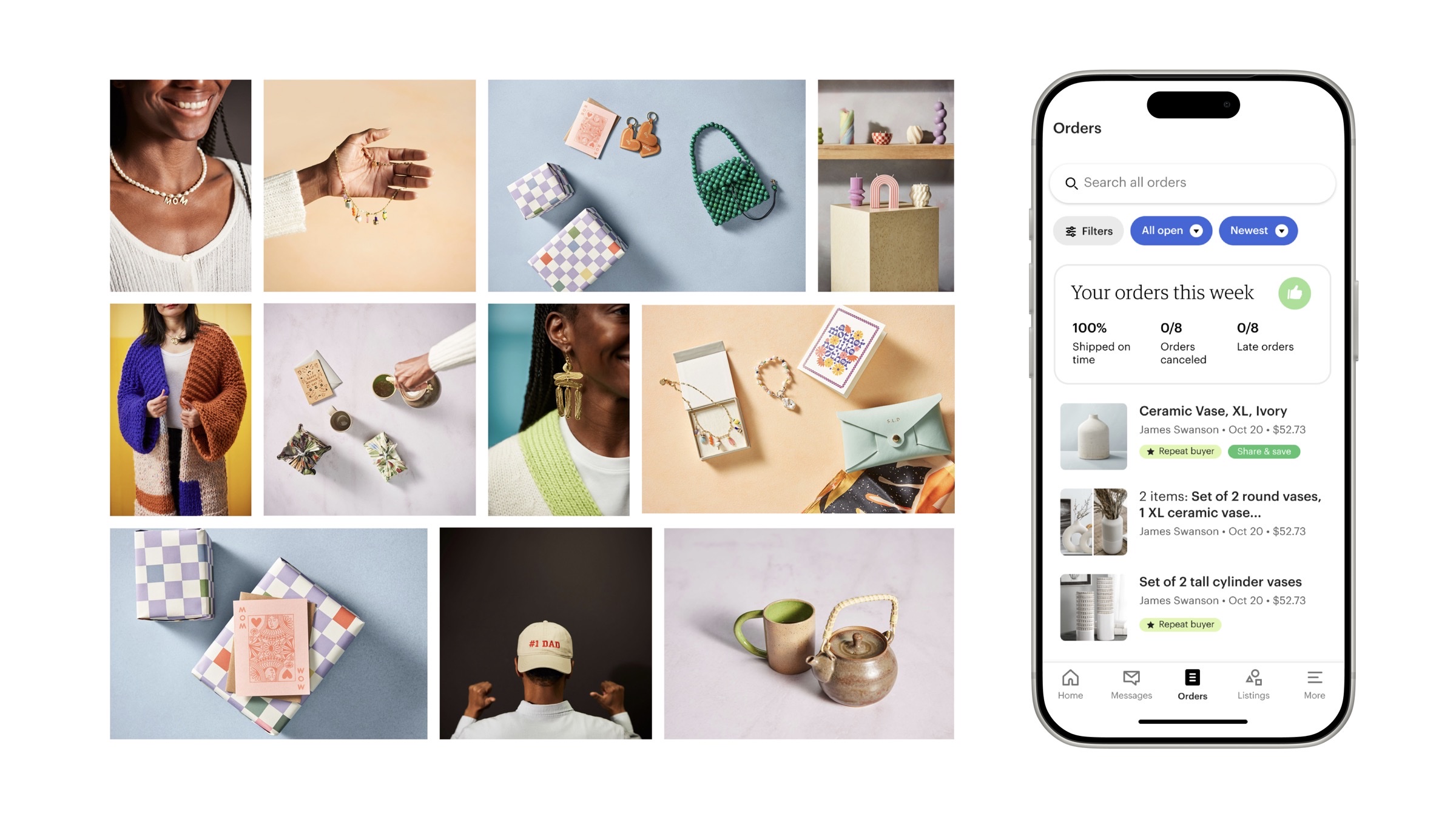
Fig 1: Reimagined mobile experience for Etsy sellers · Etsy Seller App (ESA)
Context
At Etsy, my team sat within the Seller Experiences group, one of three major experience areas alongside Trust & Safety and Marketplace Inventory. My focus was the tools that empowered sellers to grow their business and build their buyer base. That meant owning two primary surfaces: Shop Manager (responsive web) and the Etsy Seller App (ESA, native mobile).
The scale of the seller-side work was significant:
$2.8B
Gross merchandise sales
5.4M
Active sellers on the platform
14
Seller-facing teams
The legacy app, "Sell on Etsy," built in 2017, had aged into a fragmented, trust-eroding experience that was slowing seller business growth. It ran on two distinct native codebases, which had created compounding technical debt that slowed our speed to market. Rebuilding it wasn't optional. The question was how to do it without losing the sellers who depended on it daily.
The Problem
Built in 2017, the aging "Sell on Etsy" app suffered from a fragmented user experience that slowed business growth and eroded seller trust. Core workflows were inconsistent across web and native, key features were hard to find, and the tool didn't reflect how sellers actually ran their businesses.
Maintaining two distinct native codebases had become suboptimal. Technical debt had accumulated to the point where shipping new features was slow and costly, and the problem compounded with every release cycle.
The objective: Equip sellers with a tool that simplifies high-impact tasks, helps them highlight their unique products, and builds buyer loyalty to drive repeat business. Success would be measured across four dimensions:
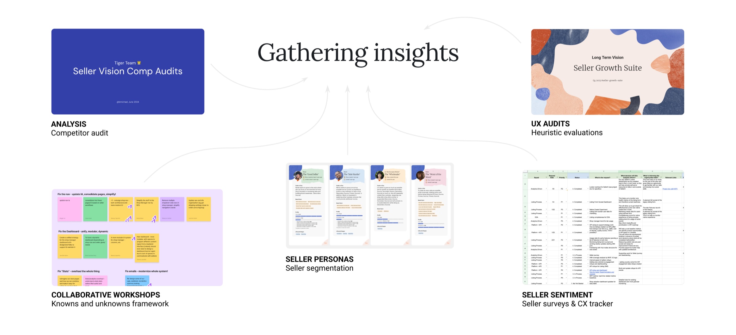
Fig 2: Research methods and seller insights that shaped the four opportunity areas
Research
We gathered insights across five methods: competitive audits, a knowns-and-unknowns workshop framework, seller persona and segmentation analysis, heuristic evaluations, and ongoing seller sentiment via surveys and CX tracker. The research converged on four seller workflow areas where the tool was consistently falling short.
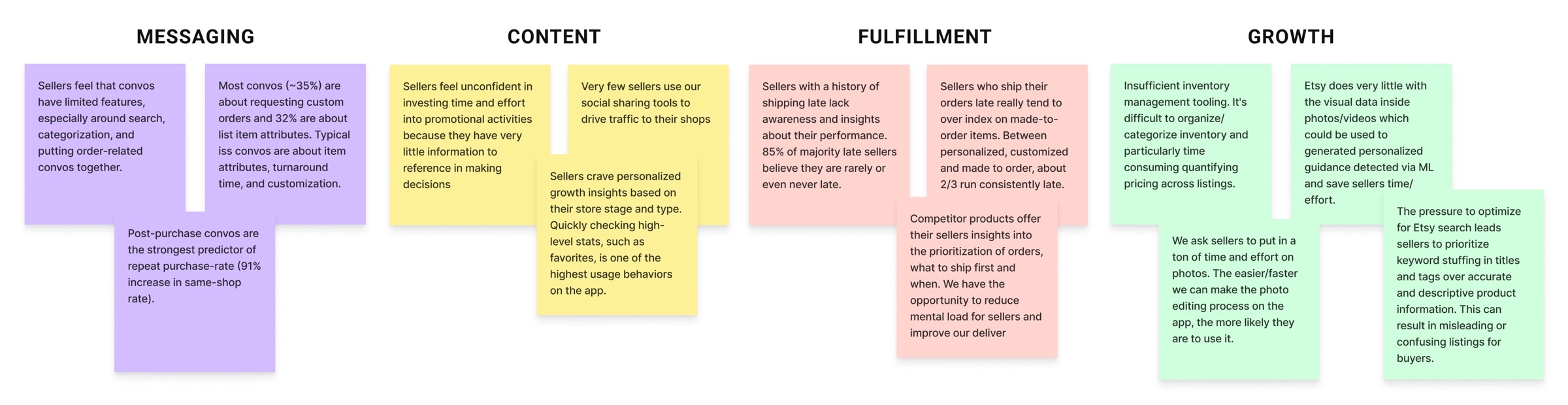
Fig 3: Key insights across the four seller workflow areas that shaped the redesign
The Work
Each workflow area was framed as a design challenge before any solutions were explored. This kept the team anchored to the actual problem, not just the feature request, throughout the design process.
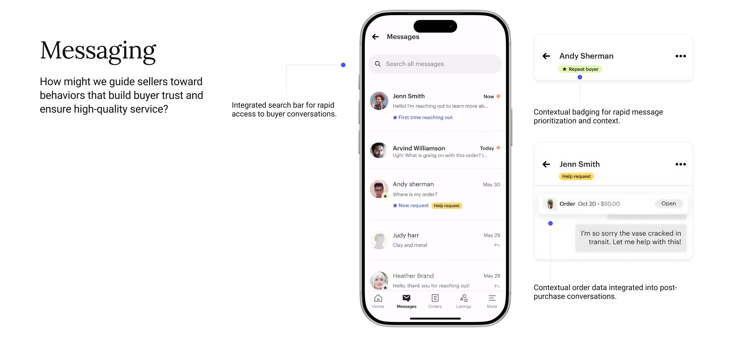
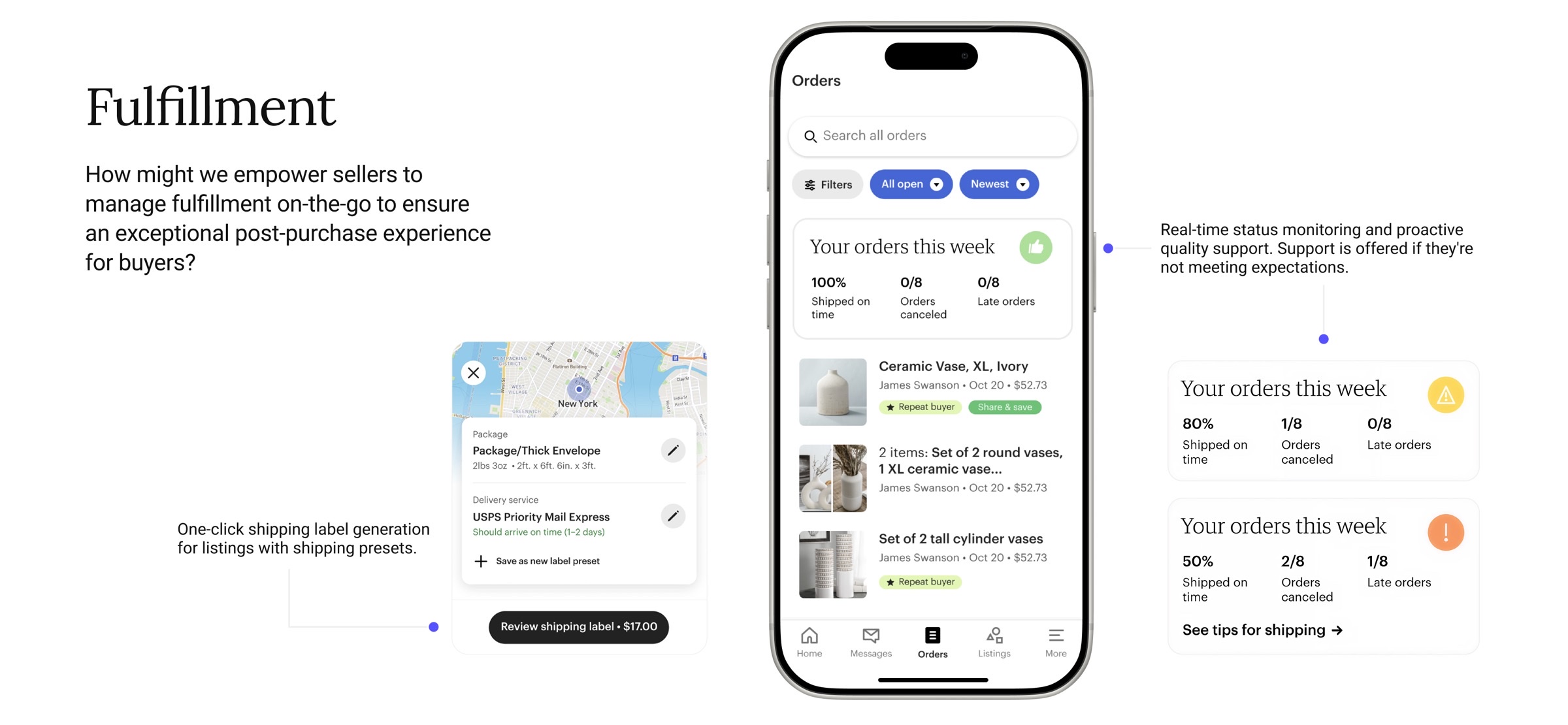
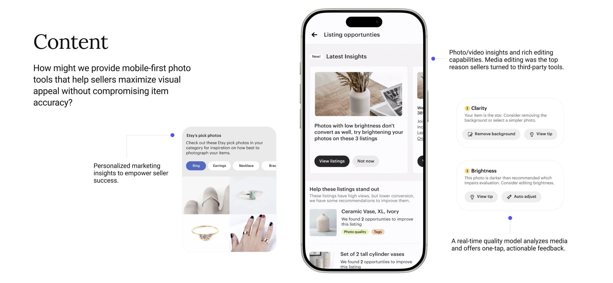
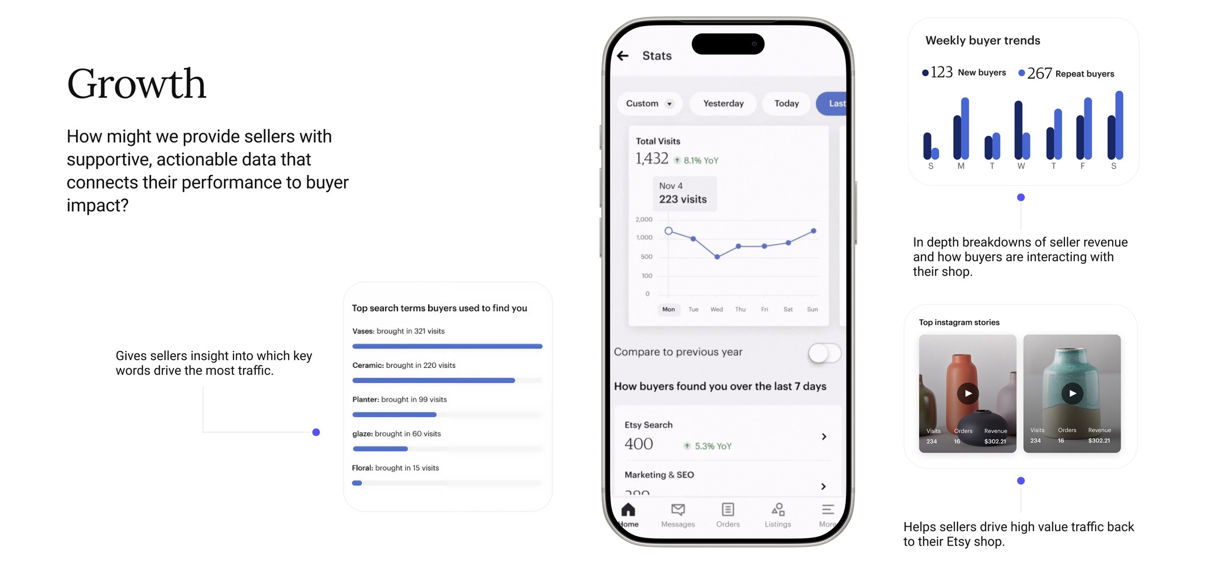
Fig 4: Design directions across the four seller workflow areas: Messaging, Fulfillment, Content, and Growth
Launch Strategy
Replacing a tool that millions of sellers use daily isn't a big-bang launch. We structured the rollout in four phases, each designed to surface and address issues before expanding to the next audience:
Feedback focused on overall satisfaction with key workflows. Small enough to iterate quickly, diverse enough to represent multiple seller segments.
Pressure testing for critical bugs. Continued surveying across seller segments. 10% of current "Sell on Etsy" users, enough scale to surface edge cases.
App availability expanded to all sellers. Tracking in-app feedback, bounce data, and feature usage patterns to identify friction in real usage.
ESA stability measured via crash-free user rate above 99%, consistent operational metrics, and qualitative seller feedback across segments before declaring the launch complete.
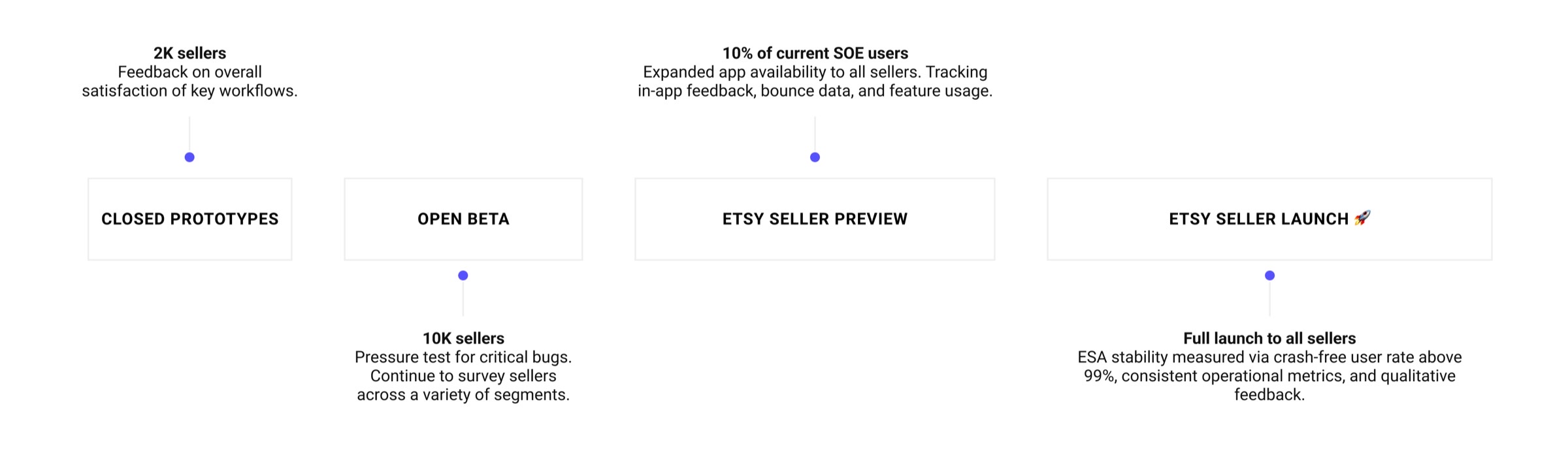
Fig 5: Four-stage launch strategy: from closed prototypes to full release
The Hard Part
This is the part of the story that matters most from a leadership perspective. During the Seller Preview phase, we hit a significant and humbling finding: in consolidating the navigation to create a cleaner, more focused experience, we had made features so hard to find that sellers assumed they didn't exist.
The feedback was direct:
"In an effort to make the app sleek, it's lost its ease of use. It feels like everything I need is hidden."
— Etsy Seller
The key learning was clear: sellers prioritize familiar functionality over new additions. Success depended on ensuring core features were both discoverable and easy to master, not just architecturally tidy from a design perspective.
We moved quickly. The nav was redesigned in a subsequent iteration, restoring direct access to high-priority features like Vacation Mode and Reviews, bringing back color and previous iconography to aid recognition, and grouping marketing tools (Etsy Ads, Sales & Coupons) into a logical "Business Management" tab where sellers expected to find them.
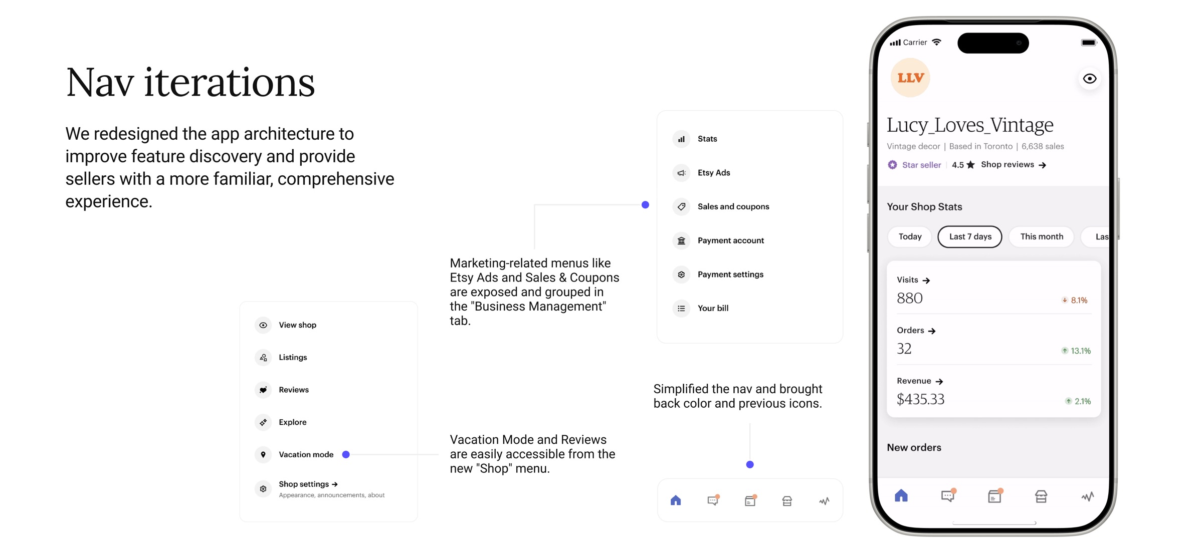
Fig 6: The wayfinding problem surfaced in Seller Preview, and the nav iterations that resolved it
Results
Since launch, the Etsy Seller App has become the primary tool sellers reach for, surpassing Shop Manager, the web-based alternative that had been the default for years.
58%
Of all seller visits now through ESA
2x
Developer velocity post-codebase consolidation
4.6
App Store rating post-launch
The 58% share of seller visits is particularly meaningful: it means the app has overtaken the web tool as sellers' preferred surface for managing their business. The 2x developer velocity reflects the payoff of consolidating the dual codebase, and the 4.6 App Store rating reflects a level of seller trust that the legacy app never achieved.
Reflections
Foundational redesigns are a tough sell: they take time and the ROI isn't immediately visible. We met heavy skepticism and had to fight to prove the project's value at every turn. I'd build the business case earlier and more explicitly, tying foundational investment to specific revenue and retention risks from day one.
The wayfinding issue taught us something important: adapting familiar workflows requires more than a redesign. It requires honoring seller mental models to ensure trust and adoption. We got there, but the nav iteration cost us time we didn't have to spare. More continuous seller testing during the design phase would have caught this earlier.
Integrating ML earlier, particularly for photo quality feedback and listing optimization, would have drastically reduced seller effort and sharpened the data quality that Etsy uses for buyer evaluations. We scoped it as a future phase; in hindsight, it should have been Phase 1.