The Onion · 2008–2014 · Case Study
Before product design was reflected in my title, I was figuring it out at The Onion, one of the most distinctive editorial voices on the internet. What started as graphic and web design work evolved into leading a full responsive redesign and shipping a Webby Award-winning iPad app. I didn't know it then, but this was where my career actually began.
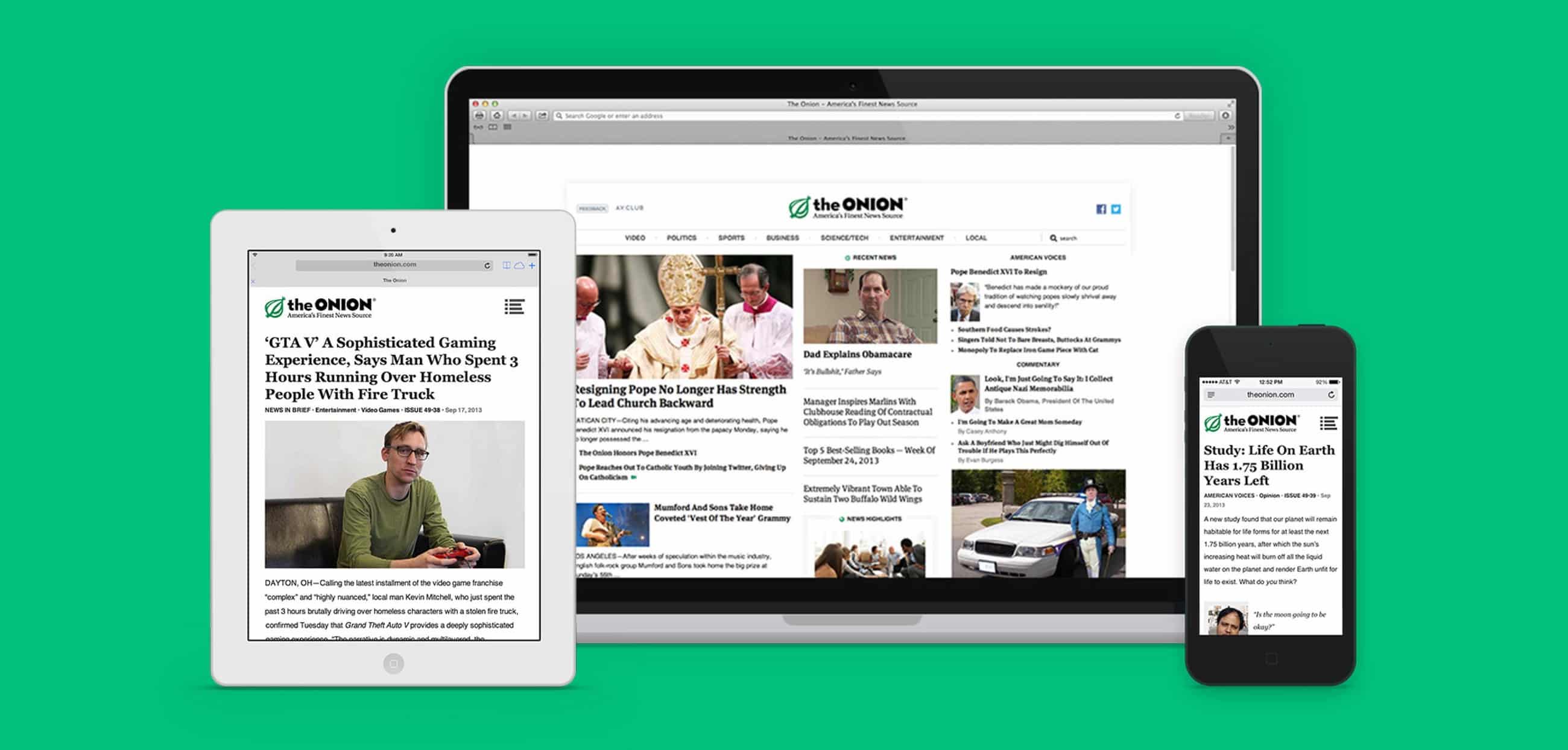
Fig 1 — Responsive redesign and Webby Award-winning iPad app · The Onion · 2008–2014
Origin Story
I joined The Onion in 2008 as a graphic and web designer. At the time, I didn't have a clear roadmap for what I wanted my career to be. I just knew I liked making things for the web, and The Onion was one of the most creatively distinct places you could do that work.
Over six years, my scope grew. I went from executing designs to leading them, eventually spearheading a full responsive redesign of theonion.com and building the iPad app that would go on to win a Webby Award. By the time I left, I had discovered what I actually wanted to do: design digital products that serve real people, at meaningful scale.
This case study is lighter on process documentation than the others. What it has instead is context: the environment that shaped how I think about design, and the project that crystallized what the work was really about.
The Environment
The Onion isn't a typical media brand. Dry, satirical, unsparing: its editorial voice is one of the most distinctive on the internet, and it created a design constraint that most digital work doesn't have: the design could never compete with the content.
Everything we built had to prime the path and support the digital content. No flourishes that distracted. No chrome that made the interface feel more important than the story. The job was to make the content as accessible and as shareable as possible, and then step aside.
That constraint turned out to be one of the most formative lessons of my career. Restraint in design isn't a limitation. It's a skill. The best interface is the one the reader never notices.
The Responsive Redesign
By 2012, mobile traffic to The Onion was growing fast, and the existing site wasn't built to handle it. The redesign wasn't just a visual refresh. It was a fundamental rethinking of how a content-heavy editorial site could work across every screen size, from phone to widescreen desktop.
The core challenges:
The iPad App
The iPad app was a different kind of challenge. Where the responsive web redesign was about adapting existing content to new viewports, the iPad app was an opportunity to rethink the reading experience entirely for a new context, someone leaning back on a couch, not hunched over a laptop.
The app was designed around the reading session, not the article. Swipeable navigation, an editorial layout that felt like a magazine rather than a website, and a content strategy built around the way iPad users actually consumed media — in longer, more deliberate sessions than desktop or mobile.
The Webby recognized it. But more than the award, what the app validated was a way of thinking: that the best digital products are designed for how people use them, not just what they need from them.
Webby Award — People's Voice
Best News & Information App · The Onion for iPad
What It Taught Me
At a media company, design serves the content, not the other way around. That orientation never left me. I still ask "what is this design trying to let someone do?" before I ask anything about how it looks.
The Onion's brand had a voice so strong that any design flourish felt like competition. Learning about design's role as a supporting actor helped shape how I approach any product with a strong user-facing purpose.
The iPad app taught me that the same content, in a different context, requires a fundamentally different design response. That lesson extends beyond media to every product I've worked on since. The right solution depends on where and how people are using it.
Timeline
2008
Handling print, web, and digital design across The Onion's editorial and marketing needs. First real exposure to high-volume, audience-driven digital product work.
2010
Scope expanded from executing designs to leading projects. Began working directly with editorial and engineering on digital product decisions, not just design execution.
2012
Designed and shipped The Onion's iPad application. Won the Webby Award for Best News & Information App. First time leading a product from concept to shipped.
2013
Led the full responsive redesign: information architecture, design system, mobile-first layout. The most complex design challenge of my time there, and the one that made product design feel like a calling.
2014
Took everything learned at The Onion — restraint, systems thinking, designing for context — into a product design career at Grubhub, where the work shifted from editorial media to B2B and B2C product.